AI Images and Brand Consistency: Staying Recognizable
At Mediengruppe RTL, my team and I looked after more than 100 social media profiles with over 20 million fans. Do you know what ate most of my time back then? Not the ideas. Consistency. Every image had to feel like the brand, whether it was made for GZSZ, a show or a whole channel. That meant templates, approval rounds and plenty of arguments.
Today, as an AI consultant at BE BRAVE and co-founder of ORION AI, I build image pipelines that deliver in minutes what used to take us days. And I see the same pattern in many companies: everyone loves how fast AI images arrive, until someone lays the last twenty posts side by side. Then you do not see one brand, you see twenty. That is exactly what I want to talk about with you today.
Why AI without guardrails dilutes your brand
An image model has no brand memory. Every prompt is a fresh start. Today your intern types 'modern office, friendly mood', tomorrow your agency partner writes 'team at work, bright and likeable'. Each result looks fine on its own. Together they add up to visual noise instead of recognition. And that is the sneaky part: every single image looks good, the damage only shows in the sum.
At Phantasialand, where I ran digital communications for a park with around two million visitors a year, I experienced how powerful a clear visual language is. Guests scrolling their feeds knew instantly: that is the park. That effect does not come from individual beautiful images. It comes from a hundred images that belong together. This is just as true for AI images as for photography, only the forces pulling things apart are much stronger.
Character and identity references: same face, same style
The most important technical answer to the consistency problem is references. Modern image models can work with reference images: you hand the model one or more pictures of your character, your mascot or your product, and it keeps the face, proportions and details stable across many generations. A random generator becomes a tool with memory. The same logic works for objects and places: a recurring product, a fictional headquarters, a signature interior.
I use this heavily myself. For the AI produced music I release as DerSchiefen, I need artworks that read as one handwriting across all singles. And in our client projects at ORION AI, every brand has a fixed set of reference images that travels with every generation job. My advice: build that reference library before you publish your first image, not after.
A style guide for your visual world
References solve the character, but not the world around it. For that you need an image style guide, as binding as your logo manual. At RTL, nobody would have waved through a show logo in the wrong color. That same matter of course is still missing for AI images in most companies. These are the points I consider the minimum:
Sounds like work, and it is, but only once. After that, the guide saves time on every single image, because debates about taste get replaced by a sober check against the document. And new team members or agencies are productive within an hour instead of three weeks.
- Color and light: two or three lead colors and a defined mood (warm, cool, high contrast), binding for every single image.
- Perspective and composition: eye level or aerial view, how much depth, how close the camera gets to people.
- Subject rules: what you show and what you never show (no cliche robots, no sterile stock photo poses, no third party logos).
- Prompt building blocks: one fixed style paragraph that goes into every prompt, plus a negative list for typical outliers.
- Reference assets: character images, product shots and sample scenes as actual files, not as vague descriptions.
- An approval step: who checks against the guide before publishing, and where rejected images end up, with reasons.
Where photography remains unbeatable
For all my enthusiasm, there are moments where I still point to the camera. Real people in real places, for example. When we realized the first professional Facebook livestream of a Klitschko boxing match with Vidpresso, the entire value lay exactly there: it is really happening, right now, right there. No generated image can replace that evidential power. Later, as CDO of a Swiss livestreaming scale-up, I saw the same thing on large productions: reality is the product.
The same goes for your team, your production floor and your customers. If your careers page shows generated dream employees, you gamble away trust that is expensive to win back later. My rule of thumb: AI for illustration, concept worlds, variants and scale. Photography wherever the image is a statement of fact: these people, this product, this place.
Labeling, rights and decency: the basics
Finally, the part many people like to skip. First: label AI images wherever they could be mistaken for reality. The EU's AI Act requires transparency for artificially generated content, and platforms like Instagram and YouTube have their own labeling rules. An honest note costs nothing. An uncovered fake costs reputation, and it costs it for a long time.
Second: no other people. Never generate anyone who recognizably depicts a real person without their explicit consent. Personality rights apply to synthetic likenesses too. Third: no names of living artists in commercial prompts. I am not a lawyer, and for concrete cases you want a specialist at the table. But I hold these three lines in every single project.
My takeaway for your practice
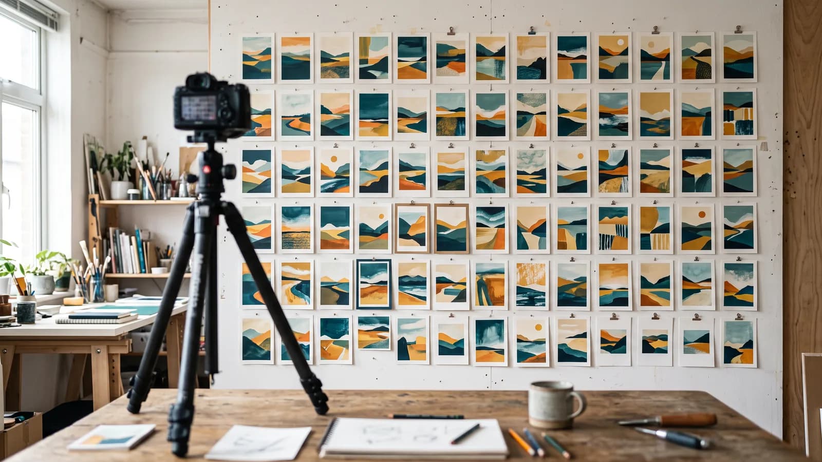
Brand consistency with AI images is not a model problem, it is a leadership topic. The tools for stable characters and styles exist. What is usually missing is the decision to take visual language as seriously as logo and tone of voice. Start small: ten reference images, one page of style guide, one fixed prompt building block. That already puts you ahead of most.
If you like, run the test: lay your last twenty published images side by side and ask someone uninvolved whether they see one brand or five. If the answer stings, let us talk about your visual world. I would enjoy the conversation.